When I hopped on a discovery call with Bridget several months ago, I knew for sure that I wanted to work with her. She’s warm and kind and loves animals just as much as I do (but probably more, honestly). And on top of all that, she’s a hard-working photographer who was thrilled to be on the call with me discussing the goals she had for her website.
You could probably already guess, but I LOVE when business owners are feeling excited about taking their website and client experience to the next level.
The incredibly talented photographer behind Bridget Caitlin Photography, Bridget specializes in wedding and brand photography in Upstate, NY, along with seasonal portrait offerings for college seniors.
After having been in business for a few years using a website she DIY-ed herself, she felt it was time to invest in website copy that was more aligned with who her business had evolved into since she started.
Sure, her current website worked, but it wasn’t working as well as she wanted it to.
(This is a situation that many business owners find themselves in after their business turns a couple years old. And it’s actually a perfect situation. Because they’ve had time to expand into their business, they’re clearer on who they are, who their audience is, and what’s unique about what they bring to the table. So investing in copywriting services at this point ensures that the copy is even more aligned with your business. And even if you still can’t quite put your finger on all of these components, a good copywriter will help you figure it out 😉).
Website Copy Project: The Behind The Scene Details
Website Goal
“My goal is for clients to really have a great sense of me and the unique client experience they will receive working with me that goes beyond just being their photographer.”
The Ideal Client
Her ideal wedding photography client is a 20-something woman living in the suburbs. Family time is important to her, with her love language being quality time and acts of service. She just bought a house with her fiance’ and they’re enjoying spending time together fixing it up. Her look is classic and timeless, and she’s slowly investing in high-quality pieces for her capsule wardrobe. A Corporate America girl, you can bet she’s detail-oriented to the core. When she’s not working or googling wedding venues, she’s spinning away on her Peloton with Cody Rigsby. And her fur babies—her dog and cat—are always close by!
Bridget’s Differentiator
Bridget’s photos are more than light and airy. They’re joyful. The happiness within her photos feels like a tangible thing. One reason for this is, yes, her incredible camera skills (10/10!). But the biggest reason has to do with how she engages with her clients—not as a business providing a service, but as that friend you’ve known forever who’s always there, ready to celebrate every milestone.
After some digging, this theme became the undercurrent that ran through her entire website.
Design
Prior to beginning the copywriting phase, Bridget had picked out and purchased a website template that she loved. Once the copywriting was finished, she would be inputting all of the copy into the back end of her site herself.
Often when writing website copy, we write first the copy and then allow that to guide the design. But when working from a template, it works the other way around. We can use the template to guide us in a different way, working backward in a sense.
One hiccup we bumped into was that her template didn’t offer as many sections as we needed to convey her messaging appropriately. Luckily, Bridget was comfortable playing around with the canvases in ShowIt, so we were able to add all of the copy we needed.
Plus, ShowIt also makes working from a template a peice of cake, which is why I’ll always love them.
As I wrote the copy, I wire-framed it as usual but left comments throughout her document suggesting which canvases she could use that were already within her template. And then once she input all of the copy towards the end of her project, I ran through it multiple times, offering additional edits and minor design tweaks.
Now I’m by no means a designer, but since Bridget wasn’t working with one, I wanted to make sure that she still had all the support she needed to create the website she was envisioning!
The Finished Product
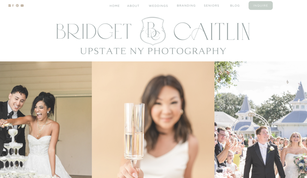
For the above-the-fold copy, we opted for simple, highlighting her logo, H1 headline, and photography. Because Bridget offers three different kinds of photography for different target audiences, we opted for a location-based keyword for the homepage—something that each of these audiences is searching for.

Right below the fold, her intro statement covers what she offers and who she offers it for. Immediately answering visitors’ first question: “Is this for me?”
Again, because we had to cover both wedding photography and brand photography audiences here, we referred to her audience as “the visionaries and the lovers.”
Speaking to her client experience
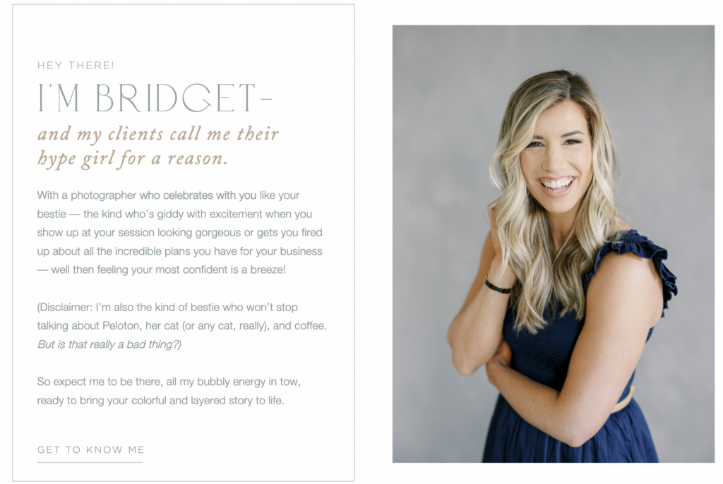
Now, as you’ll read all about in this blog post bout homepage necessities, the home page mini-about needs its own moment!
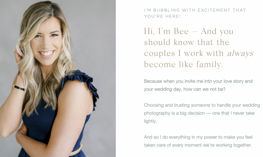
On our kickoff call, Bridget had explained to me that while so many of her clients refer to her as their “hype girl,” she wasn’t sure if that specific language resonated with the feeling she was going for. At the same time, she loves that that’s what her clients call her because that’s the energy she aims to bring to every single shoot. It’s how she wants each client to feel when they work with her.
Because so many of her clients have actually used this title to describe her and because it speaks so highly of her client experience, I felt it was too important not to include. And clearly this is the language that her audience is using!
In order to navigate around her concerns about the vibe of the phrase, we opted to approach it from a social proof angle. Just telling her audience that she’s a hype girl is one thing. But telling them that that’s what her clients call her — and then proceeding to use those testimonials throughout her site — we were able to add another layer of trust.
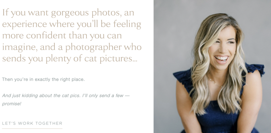
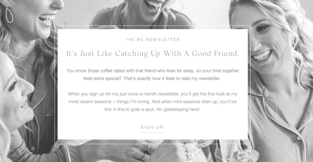
Here are a few other moments throughout her website where we highlighted similar vibes:
Getting Specific
Bridget offers three different kinds of photography and it was super important to her that, out of the three, she equally highlighted weddings and brands. This created the unique challenge of carefully crafting copy for the shared Home, About, Blog, and Contact pages.
We wanted to make sure that we were specific enough in how we spoke to both of these audiences. And by sticking with the above theme, focusing on the joint benefit of having someone in your corner, and celebrating you like a friend would, we were able to do just that.
Because this experience was the same for each of those services, even if the actual photography was not.
When it came time for each individual services page, we got to dive even deeper into the needs and desires of that specific audience.
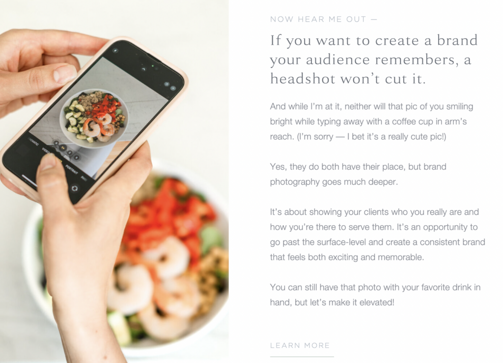
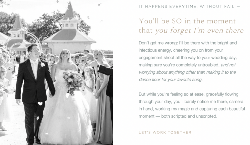
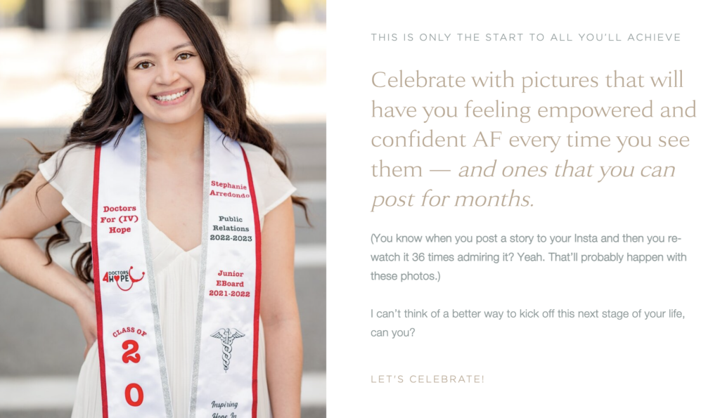
Here’s a short section from each service page that highlights the differences in the language and vibe!
Brand Photography
Wedding Photography
Senior Photography
My Favorite Moment
I’m not lying when I say that I enjoyed writing every page of Bridget’s website. But if I had to choose one part that I loved most, it was writing her Brand Photography Service Page.
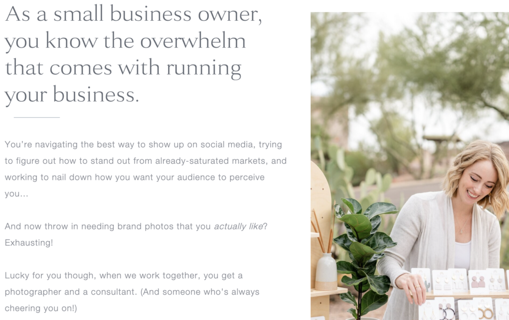
Because Bridget also has a background in marketing, she offers a more strategic take on brand photography. It’s unique from other brand photographers out there. (Which, how cool!?). So we were able to take a unique angle with this copy which felt fun and refreshing.
I couldn’t pick just one section (are we even surprised?), so here are a few of my favorite moments!

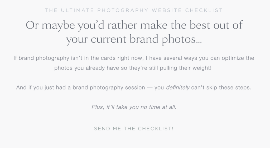
I don’t know about you, but I always love a good freebie moment! And Bridget really nailed it with this freebie.
She knows that not everyone who’s interested in brand photography is quite ready to invest in it. So she created another option that still gives her audience plenty of value. They learn how to optimize their pics and then when they’re ready to move forward, she’ll be on their radar!


Kind Words From Bridget
“It has been on my bucket list for some time to work with a professional copywriter. I wanted to make sure I found the right fit, and I found the best fit while working with Kristie! After our first call, I knew I was in good hands. Her attention to detail and thorough research really helped me evolve my copy and bring my website to the next level!
This process can be a bit vulnerable and feel overwhelming, but she did an incredible job at leading me through the process. Answering all of my questions and then some. In addition, she has a creative eye which really helped when loading the copy into the website to really make everything comes together!
I have a newfound confidence in sharing my website, and love that clients will get to know the real me before ever reaching out! I can’t recommend working with Kristie enough, and look forward to working with her again in the future!”
Now that you’ve had a moment to see bits and pieces of Bridget’s site, go check out her site here to see it in its entirety!
Hey, I’m Kristie, and I write website and email copy for the best businesses. And I’ll also help you feel grounded and less chaotic.
Here’s how we can stay connected:
Subscribe to my newsletter for all things copywriting, marketing, and self-care. So both you and your business can do great things.
Get your freebie! I’ve put together 5 quick strategies to help take your copy up a couple notches when you’re in a pinch.
Wander through my blog for more free content similar to this!
Work with me! I help with website copywriting, email marketing, and even plain ol’ copy audits if you just need someone to take a look at your work.
Send me a message! You can reach out to me right here with any questions, inquiries, or just to say hi!
So glad you’re here! XO